I love boutique hotels, and until this week, I was an advocate for the tiny room movement we’re seeing in hospitality. But one recent tiny hotel room experience drew big opinions from me.
I’ll put this out on the table: I’m a Millennial; a member of the generational group born between 1981 and 1996 (in 2018, millennials are between the ages of 37 and 22).
I didn’t grow up with the internet, but I adapted to it quickly. I got my first laptop after college, and in the decade-plus since then, I’ve gotten used to working from anywhere, which is a necessity for me, since I travel for work several times a month.
I’m also 5’3” when I’m trying, and I pack as minimally as possible. For this work trip to New York for six days, I have a backpack and a purse.
[Related Content: Travel Packing Tips for Meeting and Event Planners]
I don’t need a lot of room, so staying in a tiny room makes sense for me. I love seeing the innovation of how interior designers make the hospitality experience work in confined spaces.
Give me a place to plug in my phone and computer, and a place to sleep (sometimes the same place), and I’m golden. Or, so I thought. Because New York real estate is particularly expensive, it makes sense for hotels to think big by going small, and therefor pack more (and smaller) rooms into a property.
However, from lighting to noise-levels to surface materials and more, not all travelers necessarily agree that the comfort level of micro-hotels equals that of traditionally sized rooms.
Following is a list of the many design flaws this tiny hotel room had.
Lighting
Hotels are tricky spots because they’re high-traffic, and you never know the purpose of someone’s stay.
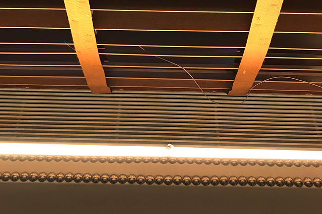
Lighting needs to set a mood, give the room personality, have enough lumens to allow the professional traveler to get work done, be UL-certified, and easily accessible from both the entry and the bed.
Personally, my favorite experiences have allowed me to turn on and off the room’s lighting from both the door and the bed. Staying in a new place can be off-putting as it is, but when you need to stumble through the dark to turn on or off the lights, it’s not an ideal experience.
However, the most important aspect of lighting from a guest perspective is that it is easily understandable. The first few moments in a room should be spent enjoying the space and feeling as if first impressions were ideal rather than attempting to find the light switch.
Plugs
At this point, I basically believe it’s a given that a plug or USB port will be made available on whatever surface is closest to the bed. If one isn’t immediately apparent, I will search the lighting for hidden ports.
It may not be a statistic that people like, but 71 percent of millennials sleep with their phone either in bed with them or on the nightstand. A majority of people also charge their phones at night. When a plug isn’t available within arm’s reach of the bed, or if I need to go searching (or worse: unplug something in the room to make space for my phone charger), it’s a frustrating experience. If a guest can’t find the light switch or a plug both in the same stay, the experience has already lost a star in the guest’s rating.
Bathroom Layout
As I mentioned above: I’m short. My height is below-average for American women by several inches. I’m not someone who needs a lot of leg space, and I can feel comfortable even in the most low-budget plane seat.
I’m emphasizing my height, or lack of, because if I’m saying the space between the toilet and the next surface is too small, it really is too small.

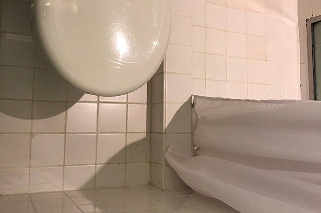
Case in point. Check out the distance between the front of the toilet and the bathroom wall.
Hotel bathrooms are tricky, but even in a tiny room they shouldn’t be an afterthought. Personally, I’m more understanding if the sink is outside the bathroom (as I have seen over and over again in small rooms) than if the space between the toilet and the wall is too close to accommodate things like knees.
Another aspect that can hinder the guest experience: what material the vanity is made of. In small spaces, thin metal makes sense because it doesn’t have the same type of weight that can make a space feel cramped. However, metal conducts heat, which is a byproduct of hair-styling tools.
The last thing anyone needs is a lawsuit because a guest was burned when the surface became hot-to-the-touch while they were getting ready.
Anything that Could Happen, Will
One of my favorite statements from a designer came during a panel discussion on hospitality design when it was mentioned that one needs to design for the idea that anything that could happen in a hotel will happen. In tiny hotel rooms, that should be emphasized.
Engineering Necessities
Oftentimes, interior designers don’t have control over things like heating and air conditioning units and where they will be placed, but when it is your design, someone else’s problem becomes a factor that can change people’s opinions of your work.
One of the most obvious problems with my room this week was apparent the moment I walked into the bedroom. It’s one of those hot, muggy days in NYC where you never quite feel cool, dry, and comfortable, and that included in the hotel room. The wood floors and walls are sealed and don’t draw in any moisture—great for upkeep and potential mildew problems, terrible for guests who don’t want to feel like they’re getting wetter the longer they dry off from the shower. The room is hot and wet.
As someone who prefers heat and often keeps the thermostat at 74, I didn’t think that was an issue.
Until it was.
The air conditioning unit is behind the headboard, and it is loud. Because it’s blowing air toward the deep window crevasse rather than into the room, keeping the temperature steady has meant it needs to blow at all times. Not only is this wasteful from a sustainability standpoint, but it means I have to choose between the constant loud blowing behind my head or waking up overheated and sweaty.

Yes, that AC unit is located directly behind the headboard of the bed in this tiny hotel room.
Interior designers may not have control over where things like air conditioning units will be placed, but it’s important to note where they will be, and how they will change the user’s experience.
Acoustics
As designer Hanson Hsu has explained to Meetings Today sister publication interiors + sources in its acoustics 101 series, acoustics in hotels is important; maybe doubly so if you’re in a small room.
I haven’t heard any of my neighbors, with the exception of a few rowdy partiers around 3 a.m. while they attempted to get to their room, but I sure know when they’re up and getting ready, because the pipes in the walls have been screeching for well over 14 hours at this point.
Again, the engineering issues are often out of interior designers’ control, but an interrupted experience comes from much more than just late-night revelers, and material choices are important.
In my current room, the bathroom walls are ceramic tile, which does nothing for the acoustics, and the walls between the bathroom and bedroom are either glass or plaster—again, neither of which do anything to dim the sounds coming from the walls.
Hotels live and die by the reviews; skimping on acoustically rated materials isn’t worth an angry guest (or especially a business traveler in town for a conference) who couldn’t sleep because their neighbor liked taking late-night showers or grabbed a glass of water when they were trying to work.
Have you ever stayed in a tiny hotel or booked one for your attendees? Share your story in the comments below, good or bad! Would you recommend a tiny hotel to your friends or business partners?


