We’ve all had the experience of entering a building or meeting venue and suddenly being lost.
Whether one is looking for an office, a bathroom or the public transport system, how they are able to navigate throughout a facility or convention center can make or break the experience. Often, attendees don’t realize the impact that finding their way has on their overall opinions of a space, but that doesn’t mean meeting planners shouldn’t have wayfinding top of mind.
Wayfinding is the use of signage, color and other design elements that helps one orient themselves and navigate within a physical space. The most optimal wayfinding is incorporated into the initial design of the venue, however if the facility is lacking, there are easy ways to integrate it into an existing floor plan at nearly any convention center or off-site venue.
1. Lighting can guide attendees to where they need to be.
Lighting is often considered one of the one-and-done aspects of design, particularly now that LEDs provide long-term solutions. Even if you’re using non-LED lighting, most systems are created to easily switch out the bulb rather than start from scratch. So spaces are now more flexible than ever.
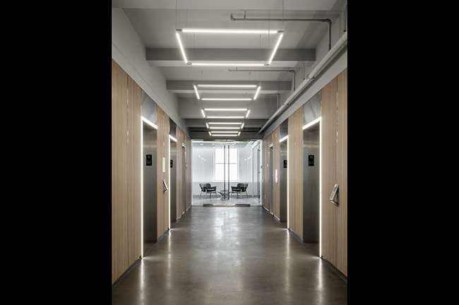
Talk with your venue to see what options are available with the in-house lighting system. If your event venue is looking to install new lighting or has the ability to change the placement of existing light fixtures, lighting can become one of the simplest ways to create subliminal wayfinding.
For high-traffic areas, particularly where visitors are coming in and out of the space, lighting can be used to provide direction and symbolize stopping points in these two ways:
- Provide direction: Tube lighting or tracks installed vertically along the main pathway can help guide attendees. Lighting that runs in the same direction that one should move gives users something to follow without a blatant arrow pointing down the walkway.
- Symbolize stopping points: In video games, a computer-controlled person of interest is often lit from above or below. Similar tactics can be used in the real-life physical space as well. Reception desks can utilize lighting in different ways than the rest of the space. This can be done by installing LEDs under the counter’s visitor-facing surface, concentrating overhead lighting above the desk or back-lighting the counter through the use of lights placed behind the desk.
Another popular use of lighting to create points of interest is through geometric lighting fixtures. In venues these often take the places where chandeliers once held dominance, square, circular, triangular or polygonal options are available either ceiling-flush or suspended. Stylish and functional!
By hanging geometric lighting above a reception desk, waiting area or other points of interest, attendees are informed that this is a place they should be attracted to. Ask your venue about the options available.
2. Flooring can point attendees in the right direction.
The interior design industry has seen huge changes in carpet overall. The most important takeaway for meeting planners and facilities managers is the fact that wall-to-wall (broadloom) carpets are out.
Instead, modular carpet tiles provide not only unique design solutions, but a less costly option in flooring as individual pieces can be replaced when damaged and stained rather than the whole floor.
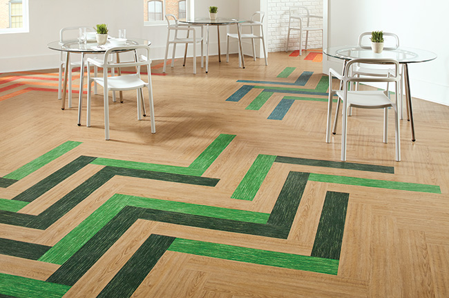
Because of the popularity of carpet tiles, flooring manufacturers are creating designs that can be used for wayfinding through installation direction, pattern, color and material:
- Installation direction: Like with providing direction through lighting, rectangular carpet tiles can be installed parallel to the way in which visitors should walk, providing a subtle point in one direction. Herringbone is another popular installation design with a less subtle—but still not blatant—ability to literally point someone in the right direction as it creates an arrow pattern.
- Pattern: Flooring manufacturers know that their products will be used for wayfinding, so you’d be hard pressed to find collections of carpet and flooring tiles that don’t have several patterns. Even ceramic or porcelain tiles incorporate different finishes and patterns into their collections so that either progressive or blunt changes in the design can act as wayfinding techniques.
- Color: Similar to the new patterns found in flooring collections, many manufacturers are incorporating color as a wayfinding technique. Playing with gradient colors provides walkways. Think of it like the Yellow Brick Road, but with fewer unfulfilled, animated fellow travelers.
- Material: Mixing carpet, LVT, wood and/or tile is another great way to create wayfinding. By keeping one material type along the pathway you would expect a visitor to follow, they will be less likely to wander. Many buildings already do this unintentionally: think of interiors where carpet is used throughout except staff-only spaces, which use LVT or tile due to durability.
3. Color can add wayfinding where it didn’t exist before.
As noted above, color can be a successful wayfinding technique in carpeting, but the same idea can be applied to walls, furniture, partitions and more. Color can easily add wayfinding to existing spaces:
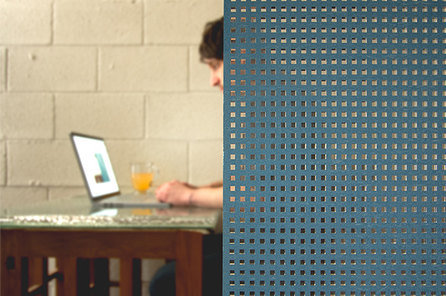
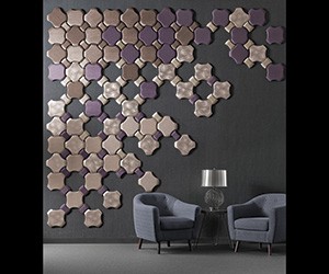
- Walls: Often called an “accent wall,” painting a single or consecutive walls in different colors or covering them with a different surface material than the rest of the space gives users the impression that they should follow that path. Check for this functionality at your venue.
- Furniture: Similarly, you can use the color of furniture to delineate different spaces in a building. Updating the upholstery on existing furniture or replacing with new pieces in similar colors can create visual boundaries in a space. So keep an eye out for what’s available at your venue.
- Partitions: Due to the influx of open office layouts, there are more partitions available than ever before, which can be used for a variety of purposes. Whether using a floor-to-ceiling system or clip-on desk partitions, partitions let visitors know which spaces are out of bounds.
4. Signage is a meeting planner’s No. 1 tool for wayfinding.
Of course, the simplest way to create clear wayfinding at any meeting or event venue is to make sure that signage is clear, legible and at appropriate intervals. If someone needs to guess whether their destination is just around the corner or on the other side of the building, it can cause frustration.
One thing of note: if your meeting has a diverse range of attendees speaking varying languages, it’s important to include symbols where applicable. Signage doesn’t need to be a hassle, either.
There are plenty of companies out there that produce creative standardized signage packages, and vinyl sticker decals are perfect stick-and-go options that can be installed nearly instantly.
And when all else fails, chalkboard sandwich boards are making a huge comeback in design.
[Read This Next: Learn how the Chattanooga Convention Center uses wayfinding to guide attendees].


