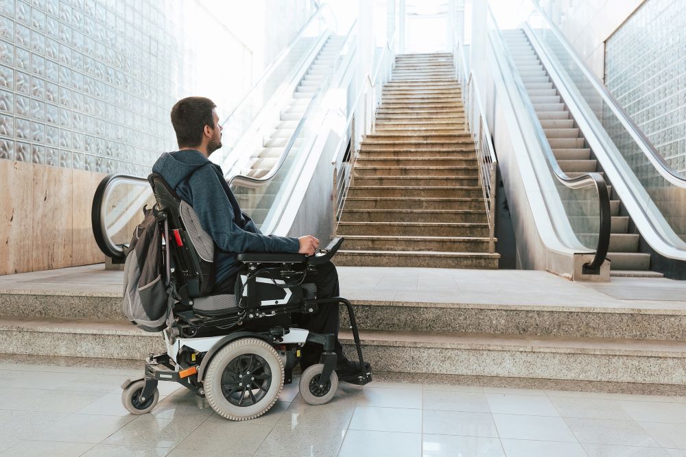
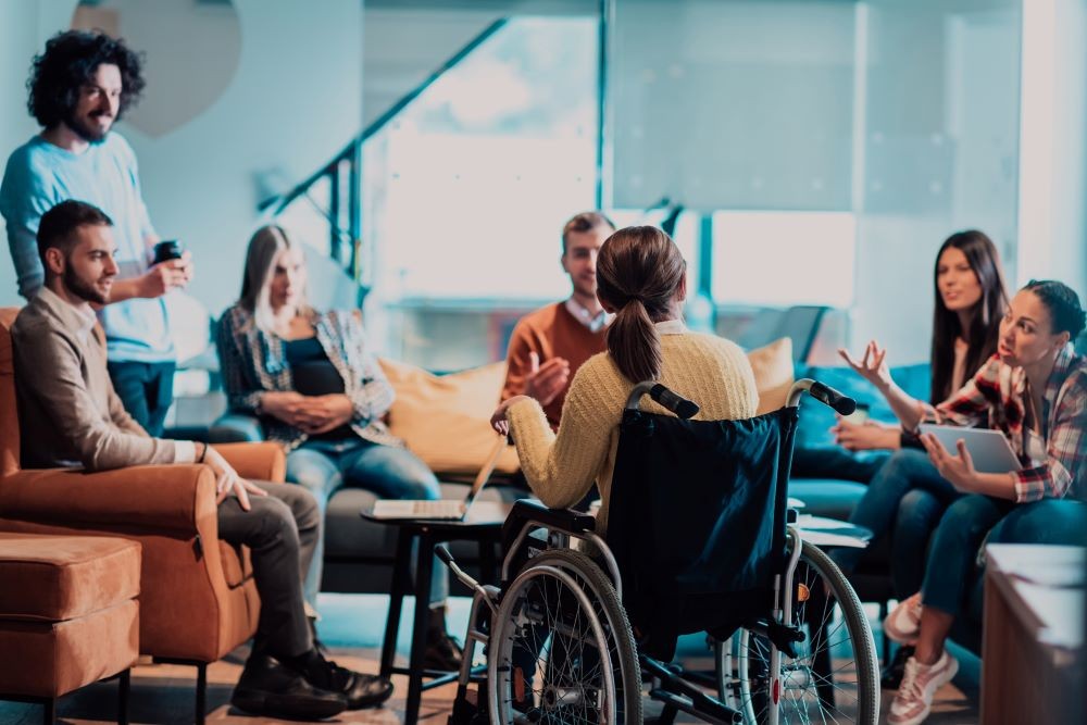
Having your event accessible to people with disabilities is more important than most truly realize. One in four adults in the U.S. have some form of a disability, ranging from those who are unable to walk to “invisible” disabilities that may not be outwardly apparent.

And while accommodating people with disabilities is not only a moral issue for many organizations, it’s also an economic one. There are nearly 4,500 accessibility-related lawsuits filed per year against organizations that did not meet accessibility guidelines. Beyond litigation, companies also lose out on large swaths of potential clients by not accommodating those with disabilities, potentially losing out on hundreds of millions of dollars.
Stephen Cutchins, senior manager of accessibility for Cvent and one of the foremost experts on event accessibility, has spent the past 15 years helping clients achieve accessibility-related goals and regularly speaks on how companies can better accommodate those with disabilities at events.
Below are four simple tips from Cutchins for meeting and event planners who want to better accommodate those with disabilities at their events.
You can also find more information about accessibility in our upcoming Meetings Today webinar No Attendee Left Behind: Making Events Accessible to All. Make sure to secure your spot before it's too late!
1. Add Captions
Captions are useful for those with any level of hearing impairments, which can range from not being able to hear noises of a certain pitch or frequency to not being able to hear at all. Closed captions help to translate what is being said to a visual format.
While some video hosting or virtual meeting platforms may have closed captioning built in, it’s important to ensure that captions are present for every aspect of an event such as speakers, live music and any audio announcements. Many AI programs also exist to help with speech-to-text and captioning, with those technologies becoming more advanced and accurate as time goes on.
2. Wheelchair Accessible Spaces
When setting up your event space, ensure that there is enough room between the rows of chairs or tables for those with wheelchairs to maneuver through. People in wheelchairs shouldn’t just be delegated to the back of event spaces where there’s “more room.” Make sure to leave extra space for those in wheelchairs or who might have service animals that also need to navigate the event space.

Food and beverage stations can also be tricky for those in wheelchairs, with many buffets and cocktail tables only allowing attendees to stand and eat. This can often make it awkward for those in wheelchairs to have a place to eat and talk with other attendees. Make sure you have some low or adjustable tables scattered throughout the event space and even some chairs for those who may not be able to stand for extended periods of time.
[Related: Check out more accessibility tips in our free Site Selection eHandbook]
3. Quiet Rooms
For attendees who might have autism or other neurodivergences that experience sensory overload, having “quiet rooms” throughout your event space will be a welcome reprise. These rooms can range from totally soundproof to simply providing noise-cancelling headphones or ear plugs to attendees. Quiet rooms don’t always have to be completely silent, but they should offer significantly less noise and stimulation compared to other areas of the event.
As Cutchins also points out, many accessibility accomodations don’t just help people with disabilities. Everyone can benefit from captions, more room to maneuver in venues or a quiet place to recharge. Creating accessible events benefits all attendees, not just those with disabilities. Additionally, many attendees may have “invisible,” or non-apparent, disabilities, making it even more important to make your event accessible to everyone.
4. Website Accessibility
Cutchins is also an expert in helping event organizers make their website more accessible to those who use screen readers or have reading and processing disabilities. Many event websites are extremely difficult to navigate for these individuals.
While there are multiple guidelines to keep in mind, Cutchins stresses the importance of not having “walls of text” on your site that make text difficult to read and digest, not spelling out directions on your website (for instance, having a link to your event application reading “apply now” vs. “click here to apply now”) and using colors to denote certain feelings or emotions. Also, people who are colorblind may not be able to determine that something written in red is bad or a mistake.
Read this next: Fast Forward - What the Future of Event Accessibility Looks Like


