ANAHEIM, Calif.
The Anaheim/Orange County Visitor & Convention Bureau (AOCVCB) unveiled its new name, Visit Anaheim.
After more than 20 years as AOCVCB, the destination marketing organization (DMO), streamlined its name and introduced a fresh new brand that aims to invoke the past, present and future of the destination, while encouraging travelers to do what the name suggests: Visit Anaheim.
“A year’s worth of brand exploration, consumer, meetings and travel trade research told us clearly that we needed a name and brand that is reflective of our organization’s mission,” said Jay Burress, president & CEO, Visit Anaheim. “Visit Anaheim is a name that travel enthusiasts and conventioneers can easily find and understand. It evokes a sense of discovery and clearly communicates that we have an incredible, awe-inspiring destination.”
The second-largest city in Orange County, Anaheim has undergone a substantial revitalization and beautification effort in recent years. It is now not only home to some of California’s most exciting and prestigious attractions and sports venues, but an exploding foodie culture and brew scene as well.
“Our new look is bold, timeless and delights in the uniqueness of Anaheim. It also perfectly encapsulates the next stage we are entering into as an organization," Burress said. "We are here to help inspire the imagination of every visitor that comes to our destination – whether they’re a sports fan, adrenaline junkie, beach lover, theme park enthusiast or foodie – and change the way they see the world."
To land on its new name and brand essence, the DMO conducted multiple focus groups and key stakeholder interviews in and around Anaheim, Orange County, Los Angeles, Phoenix and San Jose to better understand how travelers perceived the destination, which includes Anaheim, Garden Grove and the greater Orange County.
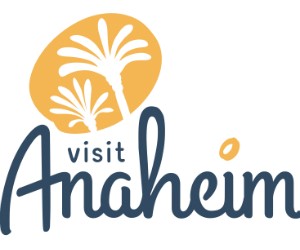
As for the new logo, it was designed by Kansas City-based MMGY Global, a travel marketing agency, and has multiple design elements that speak directly to Anaheim and Orange County’s past, present and future – the big “A” is reminiscent of a number of big A logos around the destination; the looped “h” is similar to an Anaheim logo created by a former Disney creative; the dot over the “i” is Disney’s dot; and the palm tree icon speaks to the City of Anaheim’s robust revitalization. The logo’s colors, blue and marigold, are a tribute to Southern California’s ocean views, blue skies and sunny days.


